Why email performance needs a dedicated dashboard
Volume metrics like 'emails sent' tell a manager almost nothing about whether outreach is working. A rep who sends 80 emails a week with a 2% reply rate is underperforming compared to a rep who sends 30 emails with a 15% reply rate — but a simple activity report would rank the first rep higher. Apollo's Email Engagement Performance dashboard is built specifically to correct for this by ranking reps on quality metrics, not just volume.
Reading the 'Reps with Most Effective Emails' chart
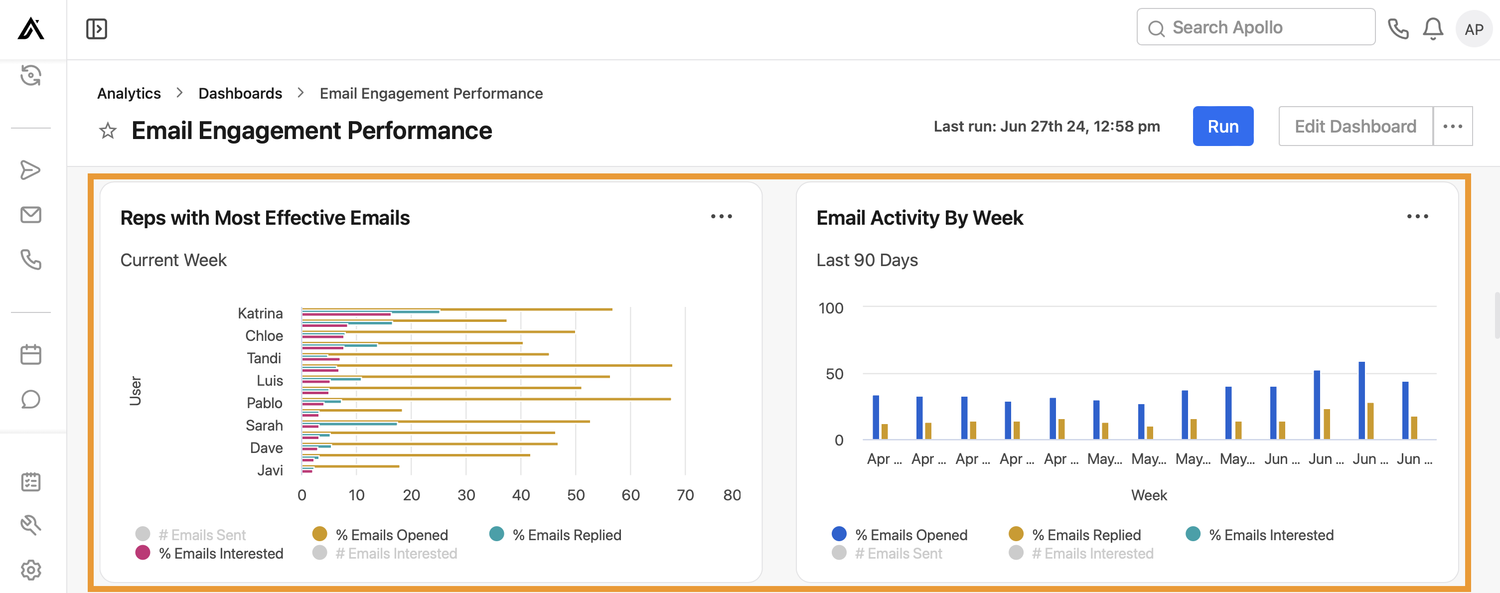
The dashboard's primary chart is a horizontal bar visualization listing individual reps — Katrina, Chloe, Tandi, Luis, Pablo, Sarah, Dave, and Javi in the reviewed screenshot — for the current week. Each rep has four overlaid metrics: number of emails sent, percentage opened, percentage replied, and percentage marked as interested.
The color legend (gray for # Emails Sent, gold for % Emails Opened, teal for % Emails Replied, magenta for % Emails Interested) lets a manager instantly separate volume from quality. In the reviewed data, Tandi and Pablo show the longest 'interested' bars relative to their sent volume — the signal that matters most for a sales leader deciding who to have shadow calls or share outreach templates with the rest of the team.
Volume tells you who is busy. The % Interested bar tells you who is actually good at this — that is the metric worth coaching around.
Email Activity By Week: the trend view
Alongside the rep leaderboard, a second chart — 'Email Activity By Week' — plots the same engagement metrics (% Emails Opened, % Emails Replied, % Emails Interested) across a rolling 90-day window, broken down by week. This view answers a different question than the leaderboard: not 'who is performing best right now' but 'is our overall email program getting better or worse over time.'
In the reviewed data, % Emails Opened (blue bars) trends noticeably higher in the more recent weeks (late May through June) compared to the April weeks, which could reflect improved subject lines, better list quality, or seasonal deliverability shifts. A manager watching this trend weekly can catch a deliverability problem — a sudden drop in open rate across the whole team — well before it shows up as a pipeline shortfall a month later.
Connecting this dashboard to deliverability health
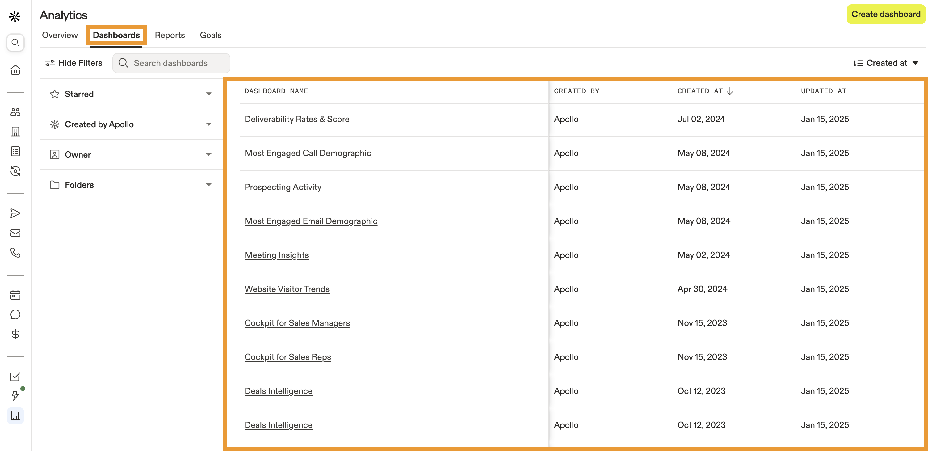
Apollo's dashboard library also includes a dedicated 'Deliverability Rates & Score' report (visible in our dashboard library review). The two dashboards are meant to be read together: if the Email Engagement Performance dashboard shows a team-wide drop in open rate, the Deliverability dashboard is the next stop to check whether the cause is a sender reputation or spam-placement issue rather than a messaging problem.
Practical use: the weekly sales email review
The most effective use of this dashboard is a recurring weekly review, not a one-time glance. A sales manager can open the Current Week leaderboard every Monday, identify the two or three reps with the strongest % Interested rate, and have them share the specific email copy or sequence step that is working — turning an individual's results into a team-wide playbook update.
Verdict
Apollo's Email Engagement Performance dashboard succeeds because it resists the temptation to rank reps by activity alone. By surfacing open, reply, and interest rate side-by-side with volume, it gives sales managers the data needed to coach toward quality outreach rather than rewarding busywork.
Combined with the 90-day trend view, this dashboard is one of the more actionable reports in Apollo's library for any team running email as a primary outbound channel.